Why Visualize Survey Results
You've collected hundreds or thousands of survey responses. Now what? Raw data in spreadsheets tells you facts, but visualizations tell stories. They reveal patterns, highlight insights, and make your research actionable.
- Stakeholders grasp insights faster with visual presentations
- Visualizations reveal patterns hidden in raw numbers
- Data becomes more memorable and shareable
- Complex findings become accessible to non-technical audiences
Matching Charts to Question Types
Different survey question types call for different visualization approaches. Here's how to match your chart to your data.
Multiple Choice Questions
Bar charts are ideal for multiple choice results. Horizontal bars work well when you have many options or long labels. Sort bars by value (highest to lowest) unless there's a natural order to the options.
Yes/No or Binary Questions
Donut charts or simple percentage callouts work well. For dramatic contrast, consider a simple stat highlight: '73% said yes' is more impactful than a pie chart showing the same thing.
Rating Scales (1-5, NPS)
Stacked bar charts show the distribution across ratings. Color code from negative (red) through neutral (gray) to positive (green). For NPS, use the standard promoter/passive/detractor breakdown.
Ranking Questions
Average rank bar charts or bump charts (for showing how rankings change across segments) work well. Always clarify whether 1 is best or worst.
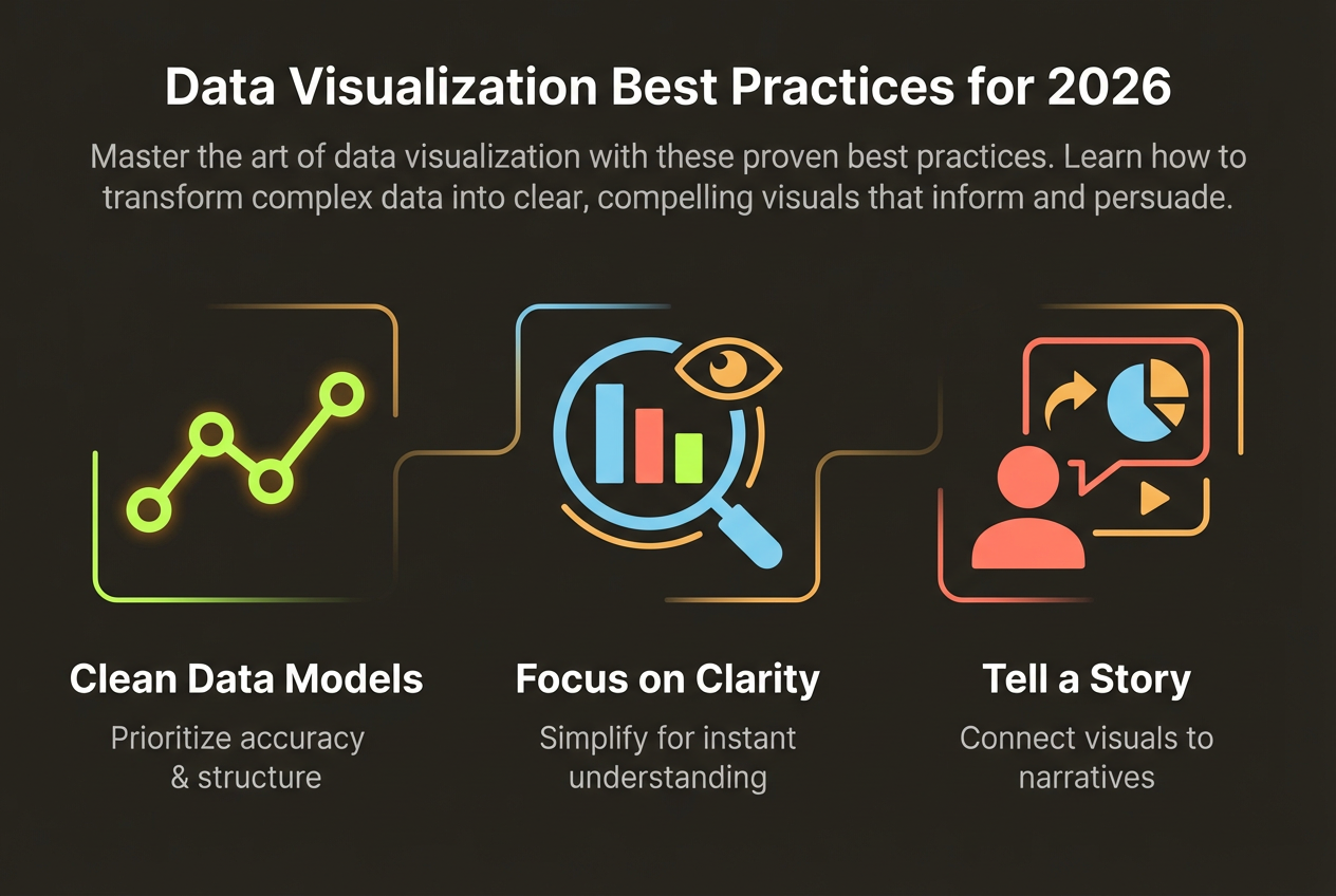
Designing for Clarity
Survey visualizations often fail because they try to show everything at once. Focus on the key insights and design for comprehension.
- Lead with the headline finding—don't make people hunt for the insight
- Include sample size (n=) so readers can assess reliability
- Use consistent colors for the same categories across charts
- Round percentages for readability (73%, not 72.8%)
- Limit each visual to one main insight
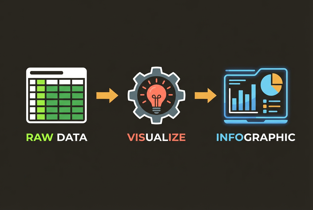
Turn Survey Data into Infographics
Upload your survey results and let AI create professional visualizations. InfoArt.ai understands your data and suggests the best chart types automatically.
Try Survey VisualizationTelling a Story with Data
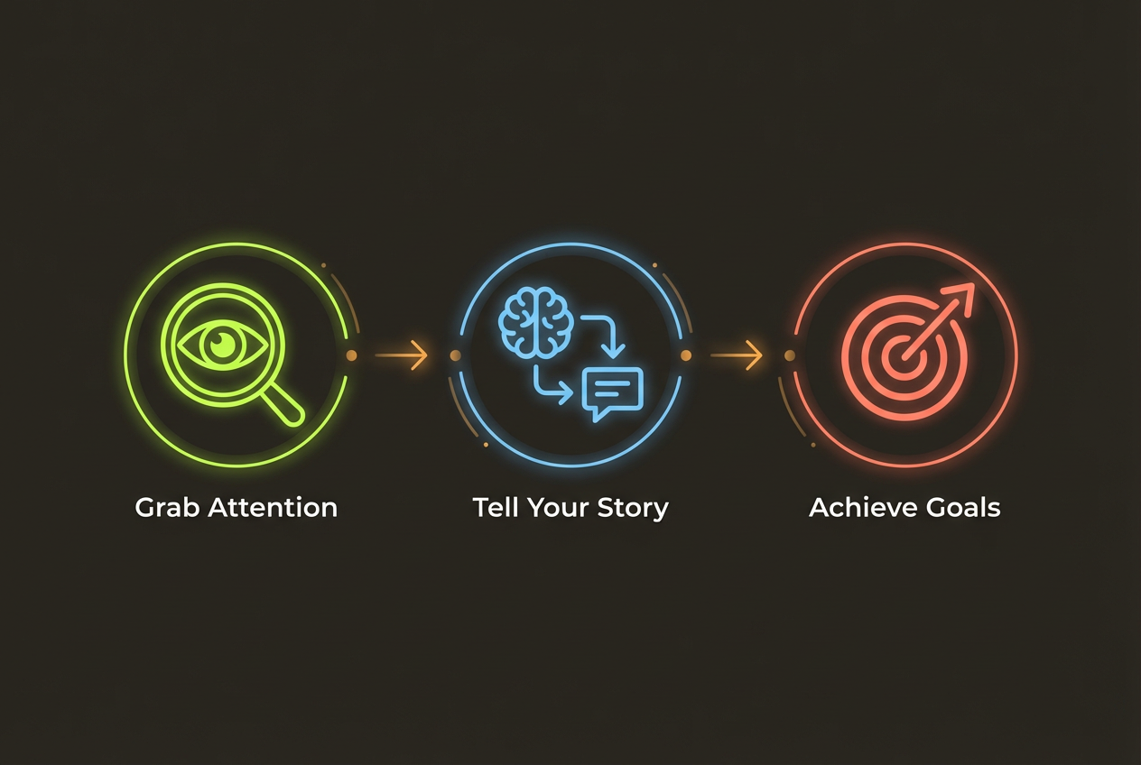
The best survey presentations don't just show data—they guide the audience through a narrative. Structure your visualizations to build toward conclusions.
- Open with context: Why did you conduct this survey? What questions were you trying to answer?
- Present the headline finding first: Lead with your most important discovery
- Support with evidence: Show the data that backs up your headline
- Add nuance: Break down by segments, show exceptions, address counterpoints
- Close with implications: What should the audience do with this information?
Common Mistakes to Avoid
Even experienced researchers make these visualization mistakes. Avoid them to maintain credibility.
- Cherry-picking data that supports a predetermined conclusion
- Using 3D charts that distort perception of values
- Omitting sample sizes or response rates
- Comparing groups of very different sizes without noting the difference
- Using misleading axis scales (truncated or non-linear)
- Overcrowding charts with too many data points
Remember: your job is to illuminate truth, not to persuade through design manipulation. Let the data speak for itself.