Why Visualize Your Excel Data
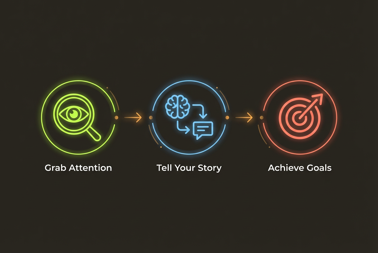
You've spent hours collecting data, building formulas, and analyzing trends in Excel. But when it comes time to present your findings, those rows and columns put your audience to sleep. The solution? Transform that data into infographics that tell a visual story.
Infographics make data memorable. While only 10% of people remember statistics they hear, 65% remember information paired with relevant visuals. For marketers, analysts, and business leaders, this difference can mean the difference between action and inaction.
- Executives prefer visual summaries over detailed spreadsheets
- Visual data is processed 60,000 times faster than text
- Infographics are 30x more likely to be read than text articles
- Data visualizations increase persuasion by 43%
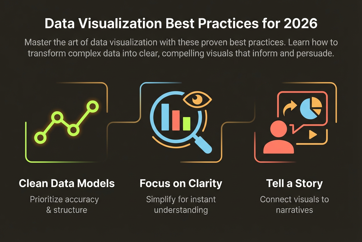
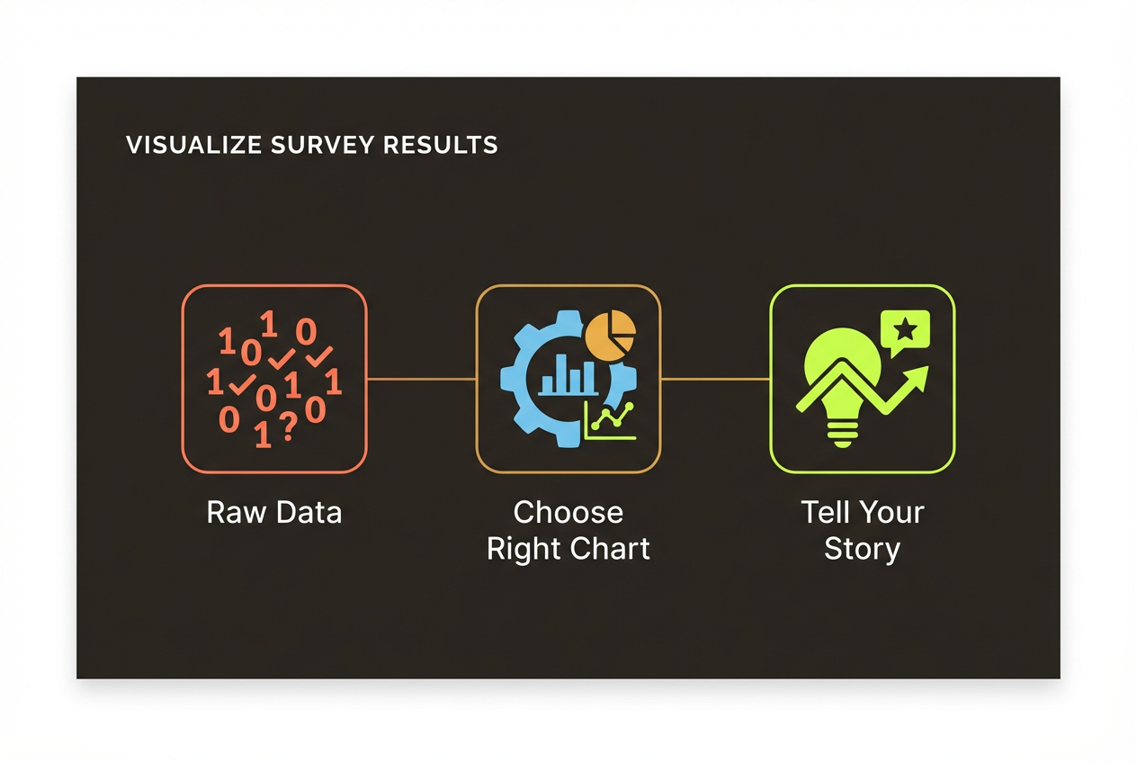
Preparing Your Data
Before you can create an infographic, you need clean, organized data. Most visualization failures stem from poor data preparation, not poor design.
Clean Your Data
- Remove empty rows and columns
- Standardize formatting (dates, numbers, text)
- Check for and fix typos in category names
- Handle missing values consistently (delete, average, or note)
- Remove duplicate entries
Structure for Visualization
Most visualization tools expect data in a specific format. Typically, you want one row per data point with columns for categories and values. Pivot tables can help restructure data for different visualization types.
Identify Key Insights
Don't try to visualize everything. Before creating your infographic, identify 3-5 key insights you want to communicate. These will drive your visualization choices and keep your infographic focused.
Choosing Visualization Types
Different data stories require different visualization types. Match your chart type to the insight you're trying to convey.
Showing change over time? Use line charts. Comparing categories? Bar charts work best. Showing proportions? Consider pie charts (for simple splits) or stacked bars (for complex compositions). Revealing correlations? Scatter plots make relationships visible.
- Bar/Column Charts: Comparing values across categories
- Line Charts: Showing trends and changes over time
- Pie/Donut Charts: Displaying parts of a whole (use sparingly)
- Scatter Plots: Revealing correlations between variables
- Area Charts: Emphasizing magnitude of change
- Tables: When precise values matter more than patterns
Using AI to Generate Infographics
Modern AI tools have made it possible to go from spreadsheet to professional infographic in minutes. Here's how to get the best results.
Upload Your Excel Data to InfoArt.ai
Our AI analyzes your data and automatically suggests the best visualizations. Upload a CSV or paste your data to get started.
Try CSV to InfographicPreparing Data for AI Upload
- Export your Excel data as CSV (File > Save As > CSV)
- Include clear column headers that describe each field
- Remove any formatting, merged cells, or special characters
- Keep the dataset focused on the story you want to tell
Writing Effective Prompts
When describing what you want, be specific. Instead of 'make an infographic,' try: 'Create a marketing report infographic showing Q3 sales growth by region, highlighting that the West region grew 45% while East declined 12%.'
Refining Your Output
AI-generated infographics are a great starting point, but refinement turns good into great. Here's what to look for.
- Verify all numbers match your source data
- Ensure chart types appropriately represent the data
- Check that colors are accessible and brand-aligned
- Confirm labels are readable and correctly positioned
- Add context that might be missing (date ranges, sample sizes)
Don't hesitate to iterate. The best results often come from multiple rounds of refinement, each time providing more specific feedback to improve the output.
Exporting and Sharing
Once your infographic is ready, export it in the right format for your use case.
- PNG: Best for web, social media, and presentations
- PDF: Ideal for printing and formal documents
- SVG: Perfect for web where scaling matters
- PowerPoint: When embedding in slide decks
Consider your audience and context. A LinkedIn post needs different dimensions than a presentation slide. An email attachment may need smaller file sizes. Plan your export format before you finalize the design.