Why Marketing Infographics Matter
In today's content-saturated digital landscape, marketers face a constant challenge: how do you make your message stand out? The answer increasingly lies in visual content, and infographics remain one of the most powerful tools in a marketer's arsenal.
Research shows that infographics are shared 3x more than any other type of content on social media. They're processed 60,000 times faster than text alone, and they can increase website traffic by up to 12% when used consistently.
- Infographics increase content engagement by up to 650%
- Visual content is 40x more likely to be shared on social media
- People remember 80% of what they see vs. 20% of what they read
- Infographics can improve SEO through backlinks and time-on-page
Planning Your Infographic
Every successful marketing infographic starts with solid planning. Before you open any design tool, you need to answer three critical questions: What's your goal? Who's your audience? What story are you telling?
Define Your Objective
Are you trying to generate leads, educate your audience, build brand awareness, or drive social shares? Your objective will shape every decision from data selection to distribution strategy.
Know Your Audience
Understanding your target audience determines the complexity of your data, the tone of your copy, and the visual style that will resonate. A B2B infographic for C-suite executives looks very different from a B2C infographic for millennial consumers.
- Identify your target persona and their pain points
- Research what visual content performs well in your industry
- Consider where your audience will view the infographic (mobile, desktop, print)
- Map out the key message you want them to remember
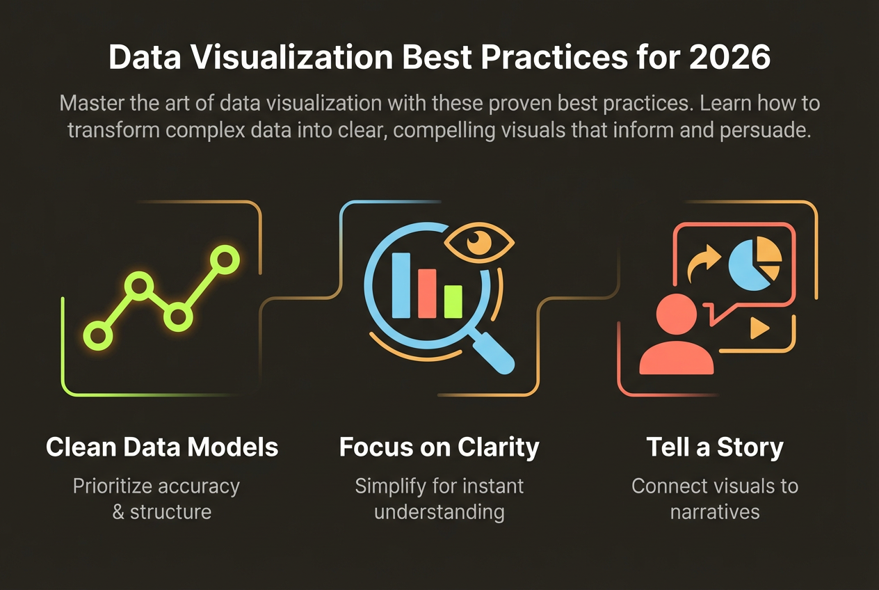
Choosing the Right Data
The foundation of any great infographic is compelling data. But more isn't always better—the key is selecting data points that support your narrative and resonate with your audience.
The best infographics don't just present data—they tell a story with data. Every number should move your narrative forward.
Look for data that surprises, validates common beliefs, or reveals counterintuitive insights. Statistics that make people say 'I didn't know that!' are gold for shareability.
- Use credible, recent sources (ideally less than 2 years old)
- Limit yourself to 6-10 key data points for clarity
- Include a mix of percentages, absolute numbers, and comparisons
- Always cite your sources to build credibility
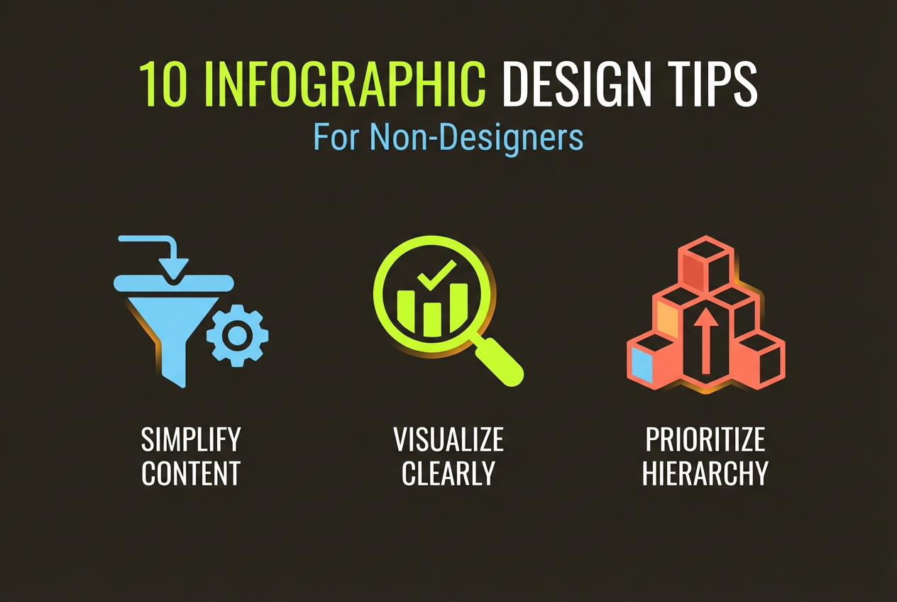
Design Principles for Impact
Even with great data, poor design can undermine your infographic's effectiveness. Follow these fundamental design principles to create visuals that communicate clearly and professionally.
Visual Hierarchy
Guide your reader's eye through the information in a logical flow. Use size, color, and positioning to emphasize the most important elements. Your headline should be the largest text, followed by section headers, then body content.
Color Psychology
Colors evoke emotions and associations. Blue conveys trust and professionalism, green suggests growth and health, orange creates urgency and excitement. Choose a palette that aligns with your brand and message.
White Space
Don't be afraid of empty space. White space (or negative space) gives your content room to breathe, improves readability, and creates a more professional appearance. Cramped designs overwhelm viewers and reduce comprehension.
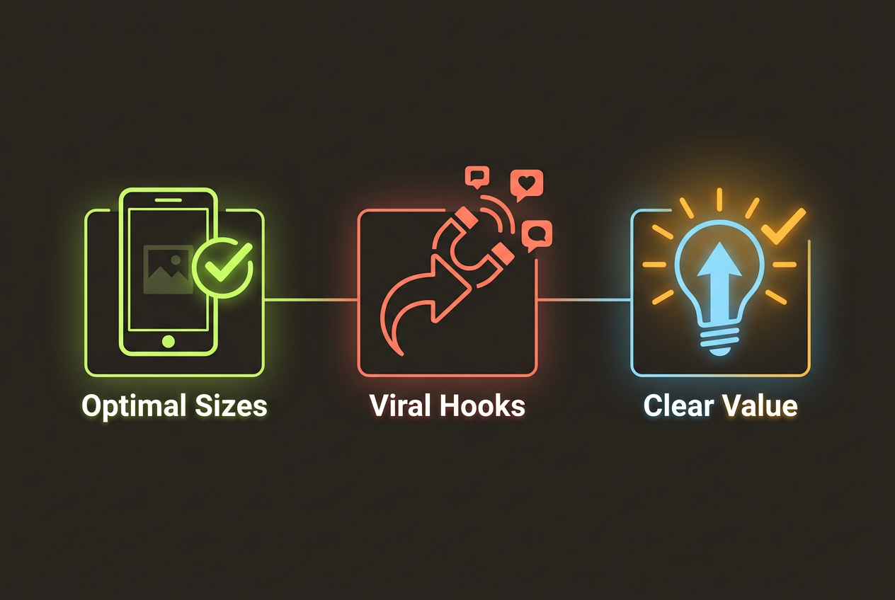
Creating with AI Tools
Modern AI tools have revolutionized infographic creation, making professional-quality visuals accessible to everyone—regardless of design experience. Here's how to leverage AI effectively.
Create Your Marketing Infographic in Seconds
InfoArt.ai transforms your data and ideas into stunning infographics with AI. Just describe what you want, and watch your vision come to life.
Try InfoArt.ai FreeWhen using AI infographic generators, the key is providing clear, specific prompts. Include your objective, key data points, preferred style, and any brand guidelines. The more context you provide, the better your results.
- Start with a clear description of your topic and goal
- Include the key statistics and data points you want featured
- Specify your preferred visual style (modern, corporate, playful)
- Mention your brand colors if consistency is important
- Iterate and refine based on the initial output
Distribution and Measurement
Creating a great infographic is only half the battle—you need a distribution strategy to ensure it reaches your target audience. And you need metrics to measure success.
Distribution Channels
- Blog posts: Embed infographics in relevant content pieces
- Social media: Share on LinkedIn, Twitter, Pinterest, and Instagram
- Email marketing: Include in newsletters and nurture campaigns
- Outreach: Pitch to industry publications and bloggers for backlinks
- Paid promotion: Boost high-performing infographics with ads
Measuring Success
Track both engagement metrics (views, shares, comments) and business metrics (traffic, leads, conversions). Use UTM parameters to attribute results to specific distribution channels.
Remember: the best infographic is one that achieves your objectives. Whether that's 1,000 shares or 10 qualified leads, define success before you start and measure against those goals.