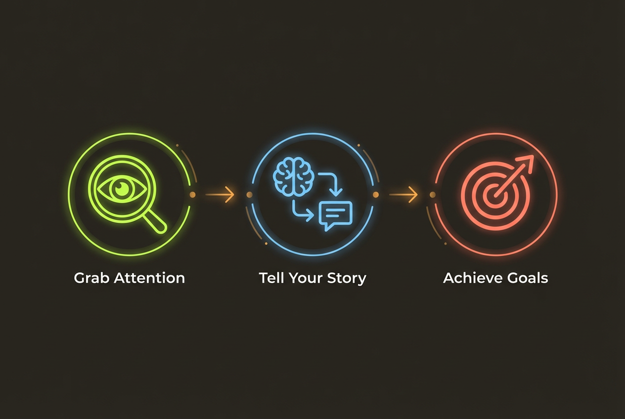
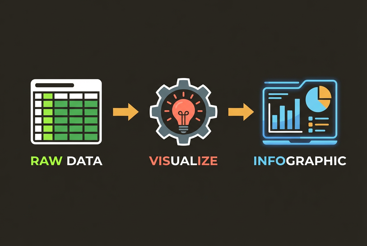
Principles of Effective Data Visualization
Great data visualization isn't about making things look pretty—it's about making data understandable. The goal is always clarity: helping your audience quickly grasp insights they might miss in raw numbers or tables.
Edward Tufte, the godfather of data visualization, established principles that remain relevant today: maximize the data-ink ratio, avoid chartjunk, and show data variation, not design variation.
- Accuracy: Never distort or misrepresent data
- Clarity: Make the main insight immediately obvious
- Efficiency: Communicate the most data with the least ink
- Context: Provide enough information for proper interpretation
- Aesthetics: Make it visually appealing without sacrificing clarity
Choosing the Right Chart Type
The chart type you choose should be determined by the story your data tells and the question you're answering. Using the wrong chart type is one of the most common visualization mistakes.
For Comparisons
Bar charts excel at comparing values across categories. Use horizontal bars when labels are long, vertical bars when showing time progression. Avoid pie charts for precise comparisons—humans struggle to compare angles accurately.
For Trends Over Time
Line charts are ideal for showing trends and changes over time. Use area charts when you want to emphasize the magnitude of change or show cumulative values.
For Part-to-Whole Relationships
Stacked bar charts and treemaps work well for showing composition. Reserve pie charts for simple distributions with no more than 5 segments.
For Correlations
Scatter plots reveal relationships between two variables. Add a trend line to make correlations explicit. Use bubble charts to add a third dimension.
Color Theory for Data
Color is one of the most powerful tools in data visualization—and one of the most misused. Strategic color choices can highlight insights and guide attention. Poor color choices can confuse or mislead.
Color should be used to highlight meaning, not to decorate. Every color in your visualization should serve a purpose.
Sequential Palettes
Use sequential color schemes (light to dark) for continuous data like temperature, density, or percentages. The progression should be intuitive: darker typically means more or higher.
Diverging Palettes
Diverging palettes with a neutral midpoint work well for data with a meaningful center value—like profit/loss, above/below average, or sentiment scores.
Categorical Palettes
For categorical data, use distinct hues that are easily distinguishable. Limit yourself to 7-10 colors maximum—beyond that, consider using patterns or grouping categories.
Typography and Labeling
Labels and text are just as important as the visuals themselves. Well-designed labels provide context, highlight key insights, and guide interpretation.
- Use clear, descriptive titles that state the main insight
- Label axes with units (%, $, units) and scale information
- Use data labels sparingly—only when they add value
- Maintain consistent font sizes within a hierarchy
- Ensure text is readable at the size it will be viewed
Your title should do the heavy lifting. Instead of 'Q3 Sales Data,' try 'Q3 Sales Increased 23% Year-Over-Year.' Tell your audience what to see, not just what they're looking at.
Accessibility Considerations
Approximately 8% of men and 0.5% of women have some form of color vision deficiency. Designing for accessibility ensures your visualizations communicate effectively to everyone.
- Don't rely on color alone to convey information—use patterns, shapes, or labels
- Test your color choices with color blindness simulators
- Ensure sufficient contrast between elements (minimum 4.5:1 ratio)
- Provide alternative text descriptions for screen readers
- Use clear, sans-serif fonts at readable sizes (minimum 12pt)
Tools like ColorBrewer and Viz Palette offer color-blind-safe palettes specifically designed for data visualization. Using these as a starting point ensures broader accessibility.
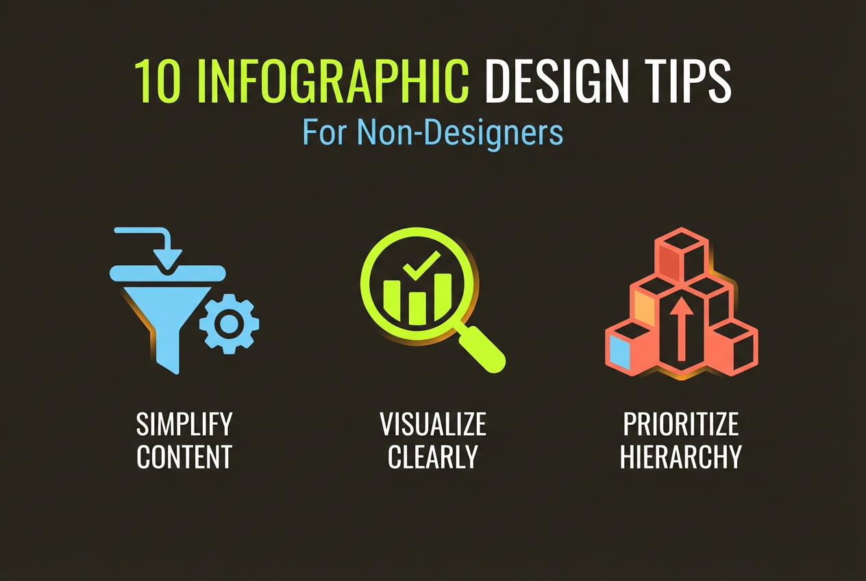
Common Mistakes to Avoid
Even experienced analysts make visualization mistakes. Here are the most common pitfalls and how to avoid them.
Truncated Y-Axes
Starting your y-axis at a value other than zero can dramatically exaggerate differences. Always start at zero for bar charts. For line charts, consider including a zero baseline or clearly labeling the scale.
3D Effects
3D charts may look impressive, but they distort perception and make accurate reading difficult. Stick to 2D representations in almost all cases.
Too Much Data
Trying to show everything often results in showing nothing effectively. Focus on the key insight and remove anything that doesn't support it. If you need to show more, create multiple focused visualizations.
Create Data Visualizations with AI
InfoArt.ai automatically applies best practices to create clear, effective data visualizations. Just upload your data or describe your insights.
Try It Free