Why Visual Communication Matters for Nonprofits
Nonprofits compete for attention in an increasingly crowded landscape. Donors have thousands of worthy causes vying for their support. Visual communication helps your mission cut through the noise.
Impact reports with strong visuals generate 94% more engagement than text-heavy reports. And in fundraising, engagement directly correlates with donations.
- Donors give 2x more when they can visualize the impact
- Visual impact reports are shared 40x more on social media
- Grant applications with infographics stand out from text-only submissions
- Volunteer recruitment improves with visual mission communication
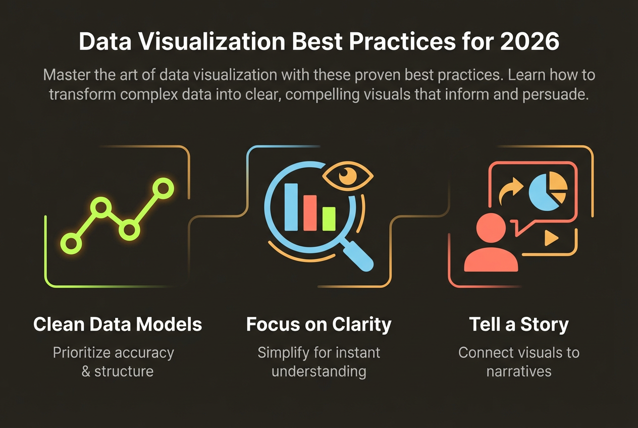
Visualizing Impact Data
Numbers tell the story of your impact, but visualization makes that story memorable. Here's how to present your data compellingly.
Make Numbers Human
Instead of '10,000 meals served,' show what that means: '10,000 families who didn't go to bed hungry.' Use icons representing people rather than abstract charts.
Show Progress
Donors want to see that their contributions make a difference. Progress bars, milestone markers, and before/after comparisons demonstrate forward momentum.
- Use icons to represent beneficiaries (1 icon = 100 people helped)
- Show year-over-year growth with simple line or bar charts
- Map geographic impact when location matters
- Include cost breakdowns showing efficiency (87 cents of every dollar goes to programs)
Donor Communication Design
Different donor touchpoints require different visual approaches. Tailor your design to the context.
Annual Reports
Comprehensive but scannable. Lead with headline achievements, follow with detailed breakdowns. Include financial transparency visualizations.
Email Appeals
Single, powerful visuals that work in email clients. One stat, one call to action. Mobile-optimized dimensions are critical.
Social Media
Quick-hitting impact stats designed for sharing. Emotional visuals paired with concrete numbers. Platform-specific dimensions.
Create Impact Reports on Any Budget
InfoArt.ai helps nonprofits create professional impact reports quickly. Free tier available for smaller organizations.
Start FreeBudget-Friendly Tools
Nonprofits often operate on tight communications budgets. Here's how to create professional visuals without breaking the bank.
- Use free or nonprofit-discounted design tools
- Create templates you can reuse for recurring communications
- Invest in a few high-quality visuals rather than many mediocre ones
- Leverage AI tools to reduce design time dramatically
- Tap volunteer designers for specialized projects
The return on investment for good visual communication is substantial. A well-designed annual report can directly increase donor retention and acquisition.
Case Study Examples
Let's look at what works in nonprofit visual communication.
The Power of One
Charity: Water transformed nonprofit communication by showing exactly what each donation accomplishes. Their visualizations make the abstract concrete: '$40 gives one person clean water for life.'
Geographic Impact
Doctors Without Borders uses maps to show their global reach, making donors feel part of an international effort. Location-based visualization works when geography is central to your mission.
Financial Transparency
Organizations that visualize their expense breakdowns (program vs. admin costs) build trust. Donors want to know their money is used effectively, and a clear pie chart delivers that assurance.